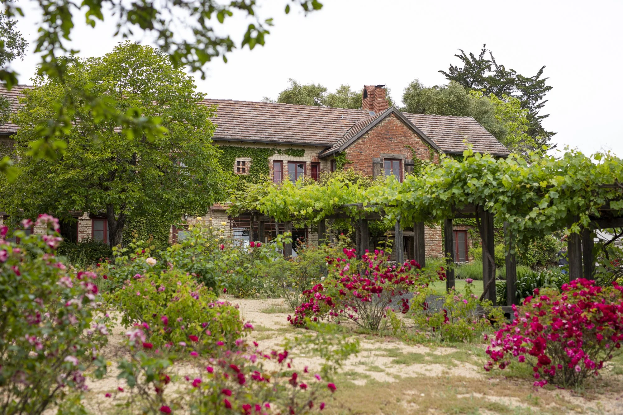
The Bishop’s Ranch
Designing a streamlined website to increase engagement with The Bishop’s Ranch, a nonprofit retreat and conference center in Healdsburg, CA.
Role
UX/UI Designer
Client
The Bishop’s Ranch, Healdsburg, CA
Stakeholders
Aaron Wright, Executive Director; Brooke Wright, Marketing + Communications Manager; Cara Anderson, Business Manager; The Bishop’s Ranch Board of Directors
Responsibilities
UX/UI design, UX research, project management, site development
Project Duration
March 2024 - June 2024
overview
the problem
The Bishop’s Ranch’s 20+ year-old website was equally difficult to navigate for guests and to update for The Ranch staff. Guests frequently couldn’t find the information they needed on the site and had to call The Ranch office instead.
the goal
Create a streamlined website to increase engagement with The Bishop’s Ranch and enable users to easily submit group reservation inquiries, register for programs and camps, and support The Ranch.
impact
The new website launched June 1, 2024. While it is too soon to assess impact on group bookings, program and camp registration, and giving, the website has received high praise from The Bishop’s Ranch community.
understanding The Ranch + the user
The Ranch’s vision
Prior to my joining the project, The Ranch worked with a storytelling agency and a board member to define their vision for the new website. They wanted to create a website that would help them connect with guests, and was “light, bright, crisp, warm, and welcoming.”
I collaborated with Brooke Wright, the Marketing and Communications Manager, to make this vision a reality. I was responsible for the UX/UI design, UX research, project management, integrating external platforms, and building the entire site in Wix.
The Ranch’s users
I worked with Brooke to understand The Ranch’s users, their needs, and the pain points of the existing website. We aimed to create an intuitive experience for new and returning users, with a focus on three main flows:
Making a group reservation inquiry
Finding information on + registering for programs and camps
Giving to The Ranch (donations and other methods)
pain points
navigation
1
Users had general difficulty finding information on The Ranch’s website, which contained hundreds of pages.
inconsistency
2
Inconsistent labels, styles, and elements created a confusing experience for users.
responsiveness
3
Users wanted to view The Ranch’s website on mobile, but it was not responsive.
maintenance
4
The 20+ year-old website was difficult to edit for The Ranch staff, resulting in outdated content.
Examples of pages from the old website
user personas
problem statement 1:
Helen is a retired lawyer who needs a way to easily find information on and sign up for programs because she wants to connect with her community and with nature.
problem statement 2:
Jordan is a music teacher who needs to find a location for their annual band retreat because it is important for them to make time for relaxing, creating music, and connecting with friends.
starting the design
information architecture
Before I joined the project, The Ranch worked with a board member to loosely outline what content would be included in new site. When I joined, I started my design process by translating The Ranch’s whiteboard sketches into a site map.
One of the old website’s main pain points was confusing navigation, so we focused on creating a clear hierarchy with intuitive organization and navigation to set ourselves up for success.
wireframes
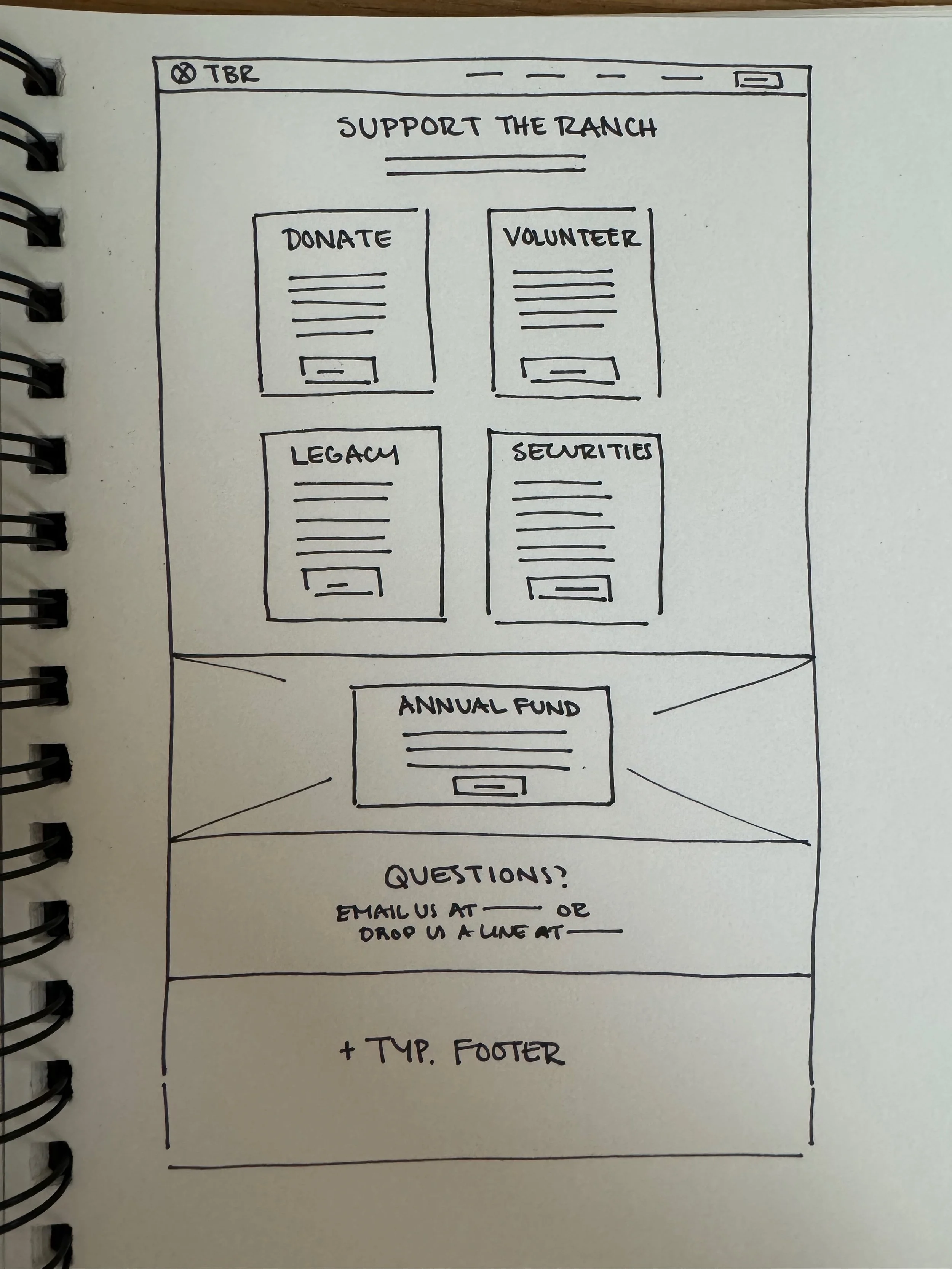
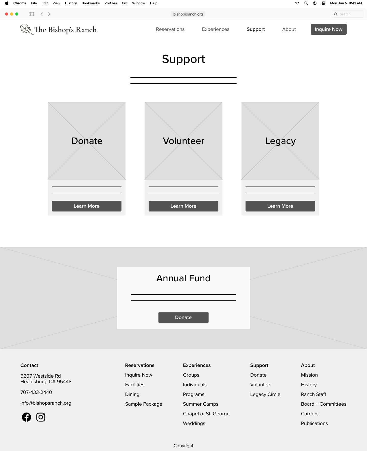
I worked closely with The Ranch team to ensure that the paper and digital wireframes aligned with both users’ needs and The Ranch’s needs. Below is a glimpse of the evolution of the 'Support Us’ page.
Existing ‘Support Us’ page - Text heavy, with a floating CTA and long fund names in the menu.
Paper wireframe - Cards for each method of supporting The Ranch, and a prominent section with Annual Fund information.
Digital wireframe - After discussion with the team, we combined ‘Securities’ and ‘Donate’ to further simplify the page.
low-fidelity prototype + testing
survey + usability study
Due to the project timeline, our low-fidelity prototype testing consisted of a survey that was sent to Ranch staff and several board members, and a moderated remote usability study with three participants with an age range of 28-71. The goal of both the survey and small-scale usability study were to see if users could easily complete the main tasks.
insights
All except one participant were able to complete the main tasks with ease. We gained several important insights from the testing:
Some page titles and CTAs needed clearer language
The Ranch’s Tax ID needed to be more prominent
refining the design
style guide
color palette
The Ranch worked with a graphic designer to update their logo and select a new color palette. I proposed updates to the color palette to make all combinations accessible and to match The Ranch’s keywords of “light, bright, crisp, warm, and welcoming.”
typography
The Bishop’s Ranch logo needed to keep its’ original typeface, Galahad. However, we were able to update the typography for all other materials, both digital and print. I proposed the combination of Cormorant Garamond for headers and Montserrat for body text.
imagery
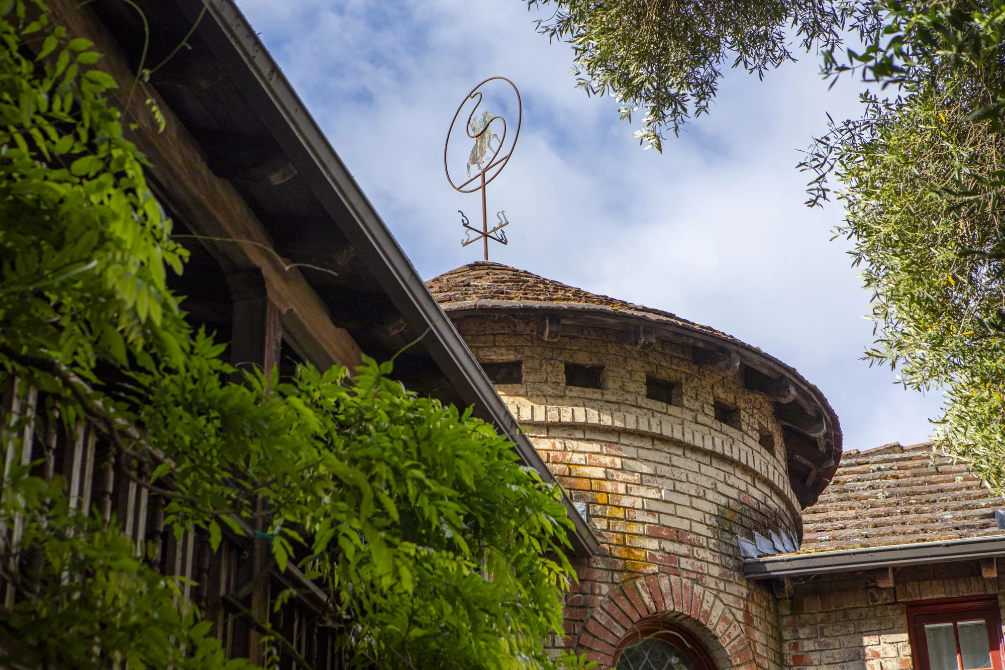
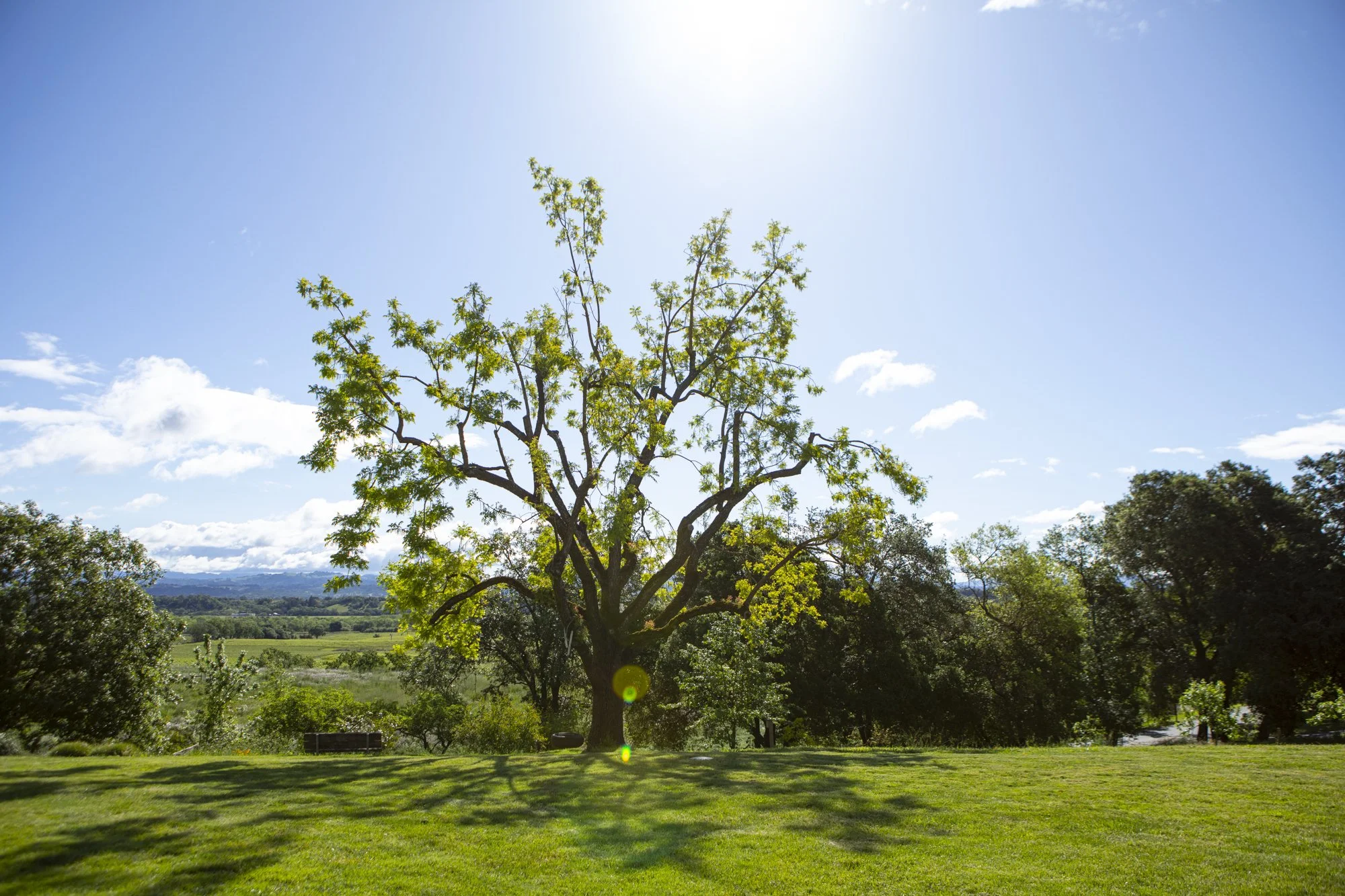
The Ranch worked with photographer Dan Quiñones to capture the beauty of their 365 acre campus and to create a consistent style across the site. The digital wireframes were used to help identify key shots.
design system + mockups
As I developed the mockups, I went back and forth between Figma and Wix to understand the website builder’s capabilities and restrictions. I built a library of components in Figma for the mockups, and eventually recreated that library in Wix’s ‘Saved Designs.’
Examples of Figma mockups
the home stretch
building the site
I built the site from scratch using Wix, which I taught myself for the project. I set the website up for easy maintenance moving forward, creating CMS for pages including careers/job openings, programs, and camp dates.
I also coordinated the integration of external platforms used by The Ranch. This included updating colors and typography in Wufoo (forms), implementing new imagery and colors in Campwise (program and camp registration), and embedding the donation and subscription forms.
Building The Ranch’s component library in Wix
launch weekend
Brooke and I presented the new website at Acorn weekend, an annual gathering of Ranch supporters, including the Board of Directors. The site was incredibly well received, with many members of The Ranch community commenting on the ease of navigation and clear paths to information.
During the weekend, we conducted a survey to gather feedback and test the site’s usability. All participants were able to easily complete the main tasks, and the SUS score of 96.25 emphasized the site’s usability.
In the time since, we have continued to iterate on the design of several pages to further improve the user experience.

impact
While it is too soon to assess the new site’s impact on group bookings, program and camp registration, and giving, the website has received high praise from The Ranch community. Feedback has included that “the content loops are very logical” and “… the new website is fabulous! Visually engaging, with great paths to the information.”
Photo by Dan Quiñones


