
Spark
Spark is a website for creative people of all skill levels to follow along with art tutorials, learn new techniques, and engage with other creatives.
Role
UX/UI Designer (solo project)
Course
Google UX Design Professional Certificate Course
Project Duration
August 2023-September 2023
overview
the prompt
Design a responsive website for art tutorials.
- Google UX Design Professional Certificate Course
the problem
Users have difficulty sorting through the many art videos on YouTube, and want quick and easy access to tutorials that match for their needs.
the goal
Create an easy to use website with art tutorials for a variety of mediums, skill levels, and goals.

understanding the user
Note: The Google UX course did not require students to conduct real user interviews. For this project, I drew from my own experience and anecdotes from creative people in my community to imagine how users might respond.
user research
I conducted user interviews and created empathy maps to better understand users needs and challenges.
Users fell into two main groups:
Users who wanted to watch a quick video and relax or follow along.
Users who wanted to watch an in-depth video and build specific skills.
pain points
time
1
Users have a hard time finding videos that match the length of time they have available.
cost
2
Users want the experience of in-person classes, but they are often too expensive.
accuracy
3
Users are frustrated by videos that don’t include information like skill level in the title or description.
sorting
4
Users are overwhelmed by the number of videos available, and don’t want to sort through them.
user personas

problem statement 1:
Emi is a busy parent and career coach who needs to quickly and easily find art tutorials so that they can relax and unwind at the end of the day.
problem statement 2:
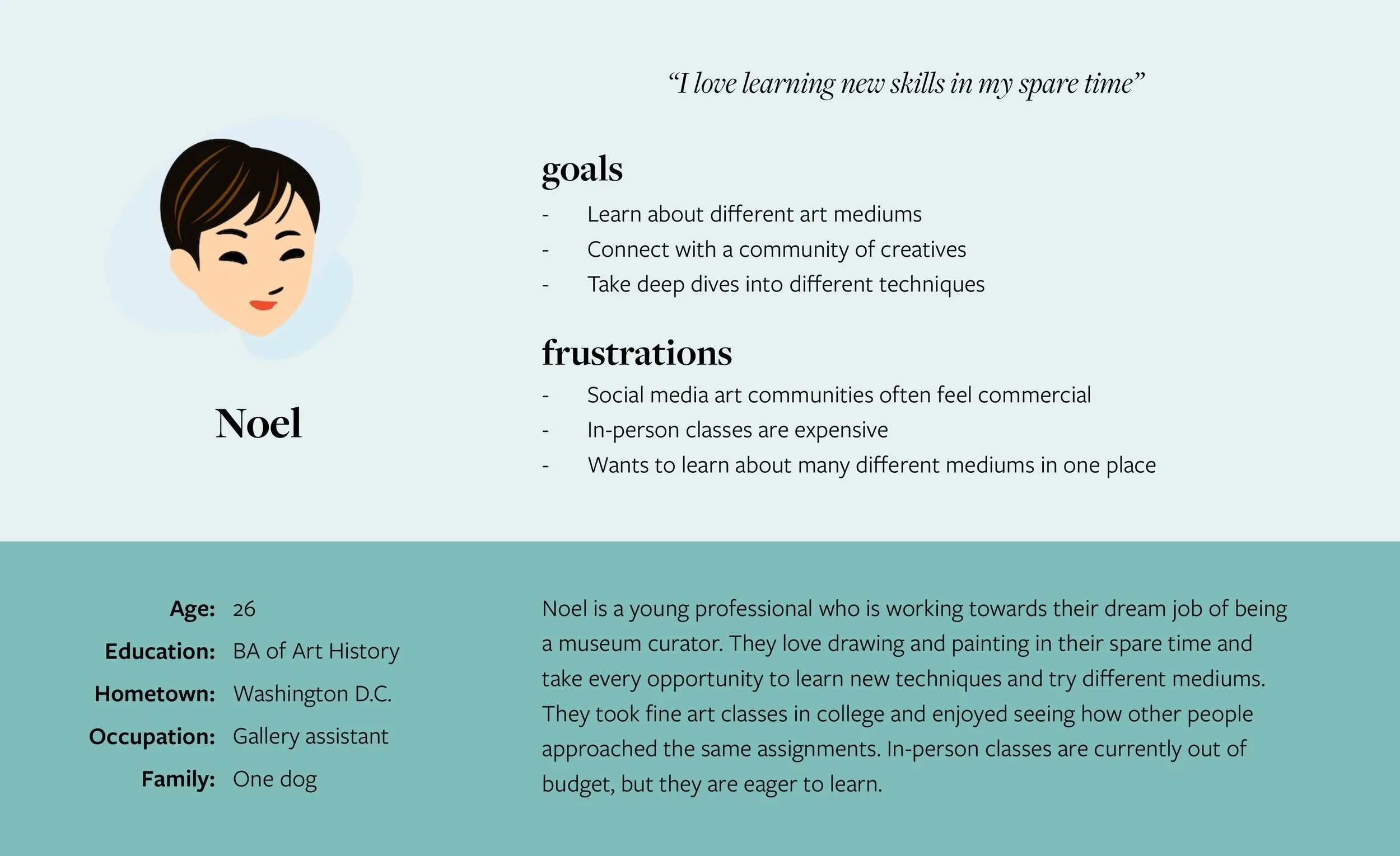
Noel is a young professional who needs a way to easily find affordable in-depth art tutorials so that they can fulfill their creative needs.
starting the design
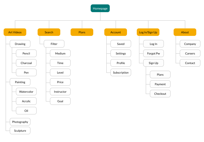
information architcture
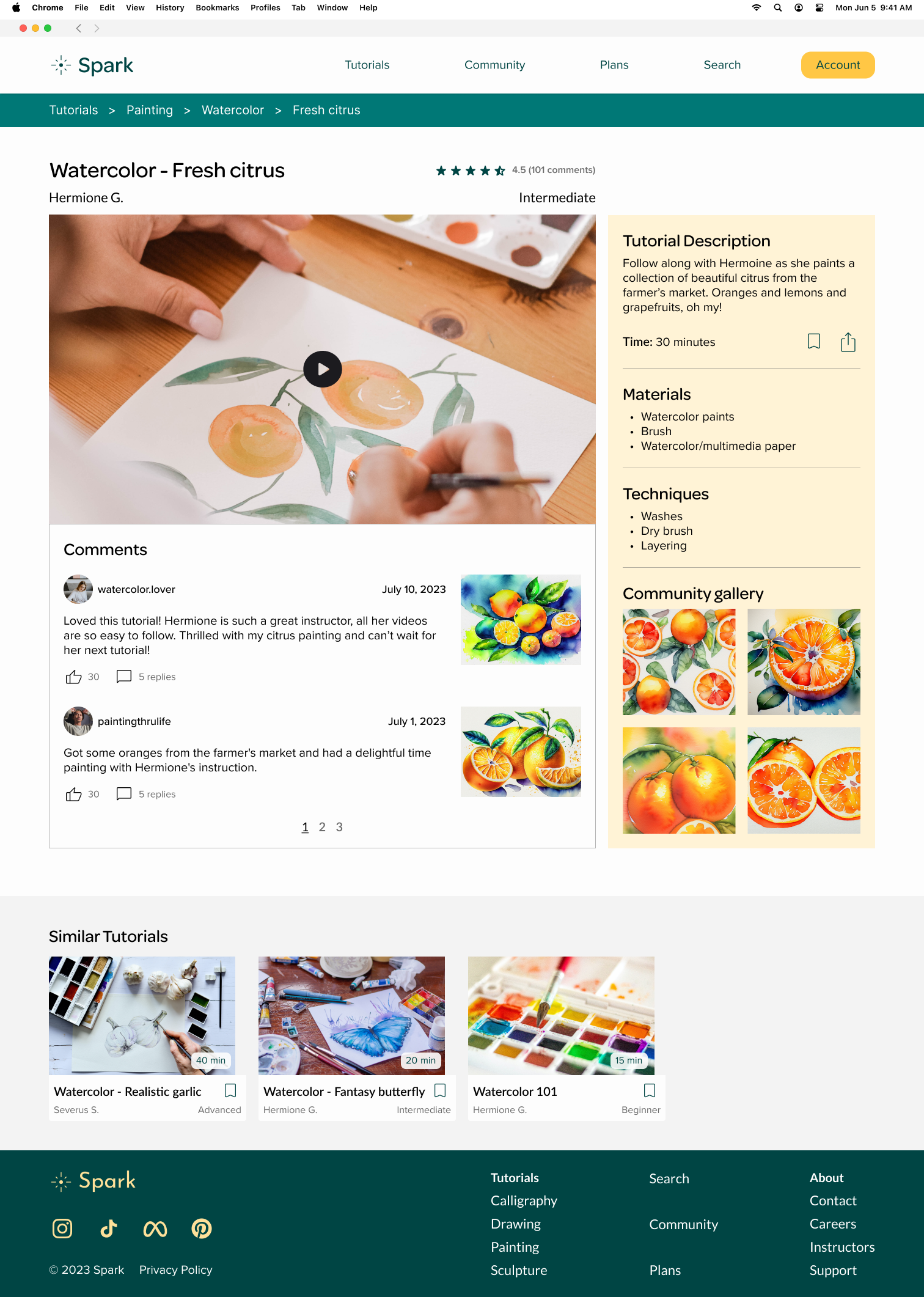
I began by creating a site map. One of the primary pain points for users was accuracy and ease, so I needed to make sure the website was intuitive to navigate and that appropriate videos could be easily found. The information architecture continued to evolve as I iterated upon my designs.
For this project, I focused on developing the user flows of selecting and watching a tutorial, logging in, and creating an account.
wireframes + low-fidelity prototype
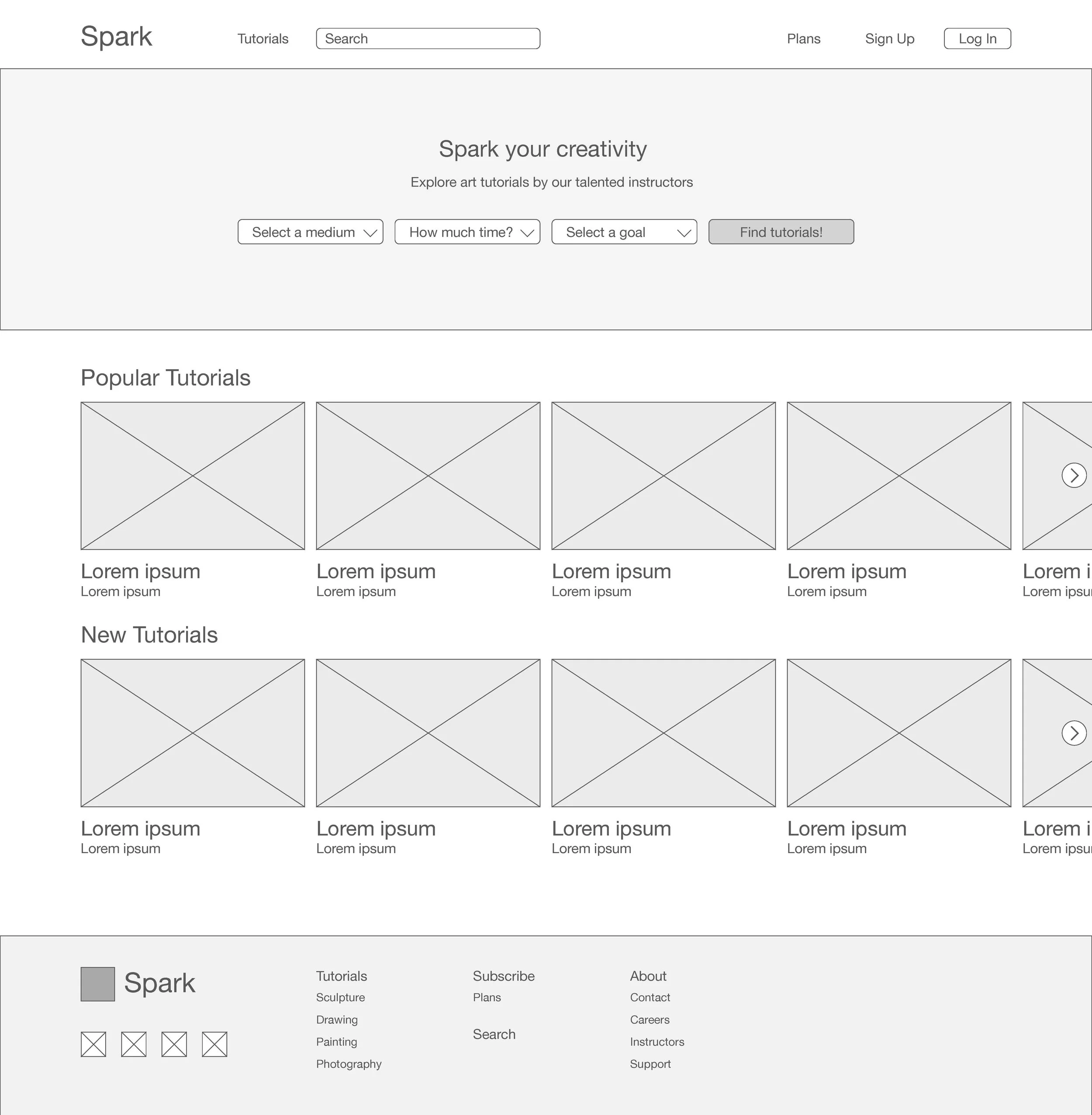
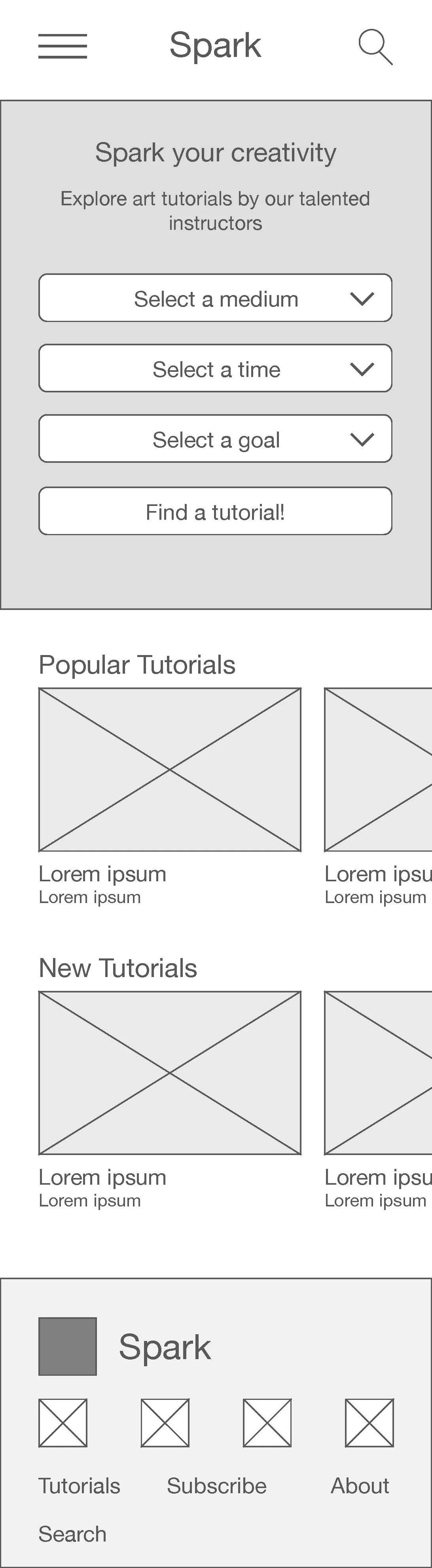
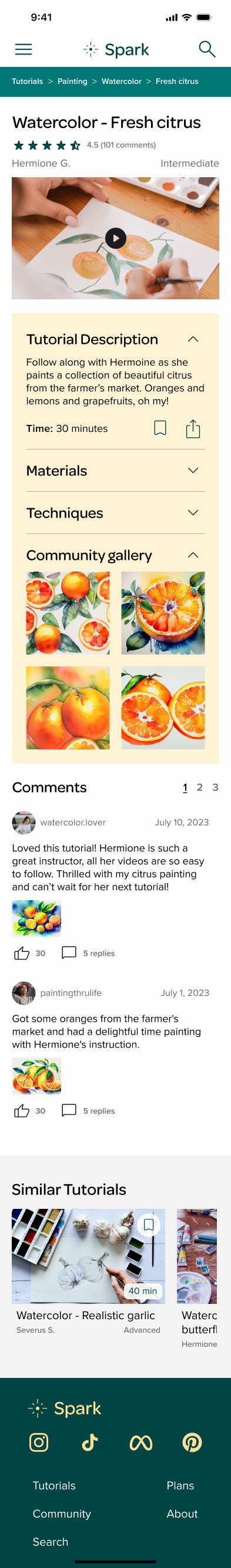
I used the graceful degradation approach for this project, and began by sketching multiple versions all desktop screens. Once my preliminary desktop layouts were intuitive to navigate, I drew the mobile versions.
As I moved on to the digital wireframes, I continued to focus on making sure users that could easily find videos that met their needs. Connecting the wireframes to create low-fidelity prototypes helped me identify missing screens and steps in the user flows.
testing
usability study
A moderated usability study was conducted remotely to understand if the website was easy to navigate and if users could complete the core task of finding a tutorial to watch. After the study, I synthesized the data by finding patterns and identifying insights from said patterns.
insights
Users wanted to engage with tutorials more - i.e. comment and post their own work.
Users wanted to see other users’ art and a stronger community aspect in general.
insights in action

refining the design
color palette
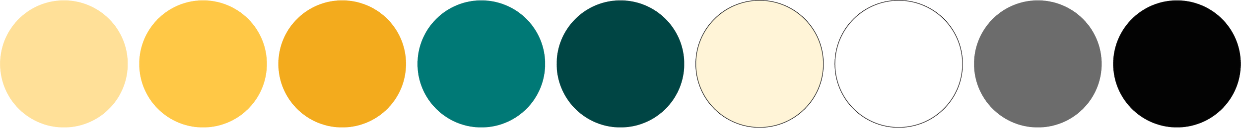
I created a color palette with combinations that met, at a minimum, WCAG AA standards. Yellow was chosen for its association with creativity and joy. Dark cyan was chosen to evoke feelings of calm and relaxation.
imagery
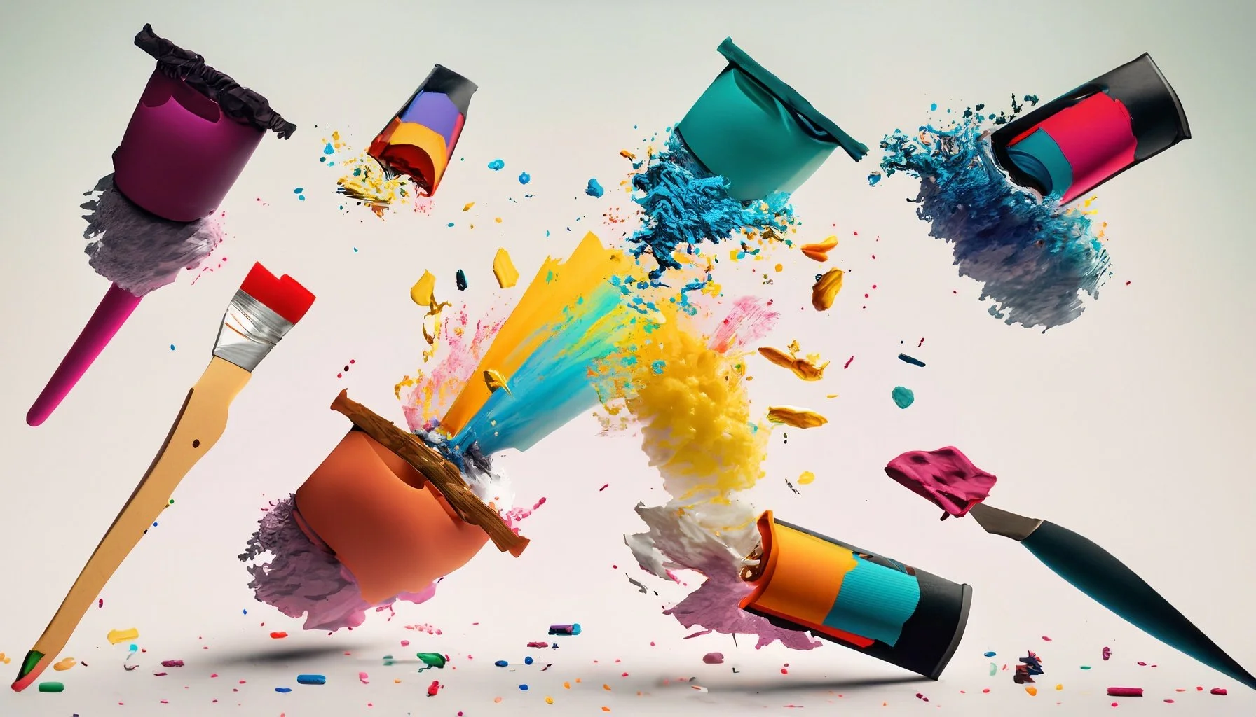
Most images were sourced from Unsplash. I experimented with Adobe’s generative AI tools in Photoshop and Illustrator for the home page hero image and orange painting images on the watercolor tutorial page.

mockups
The user flows for logging in, creating an account, and watching a tutorial were included in the mockups.
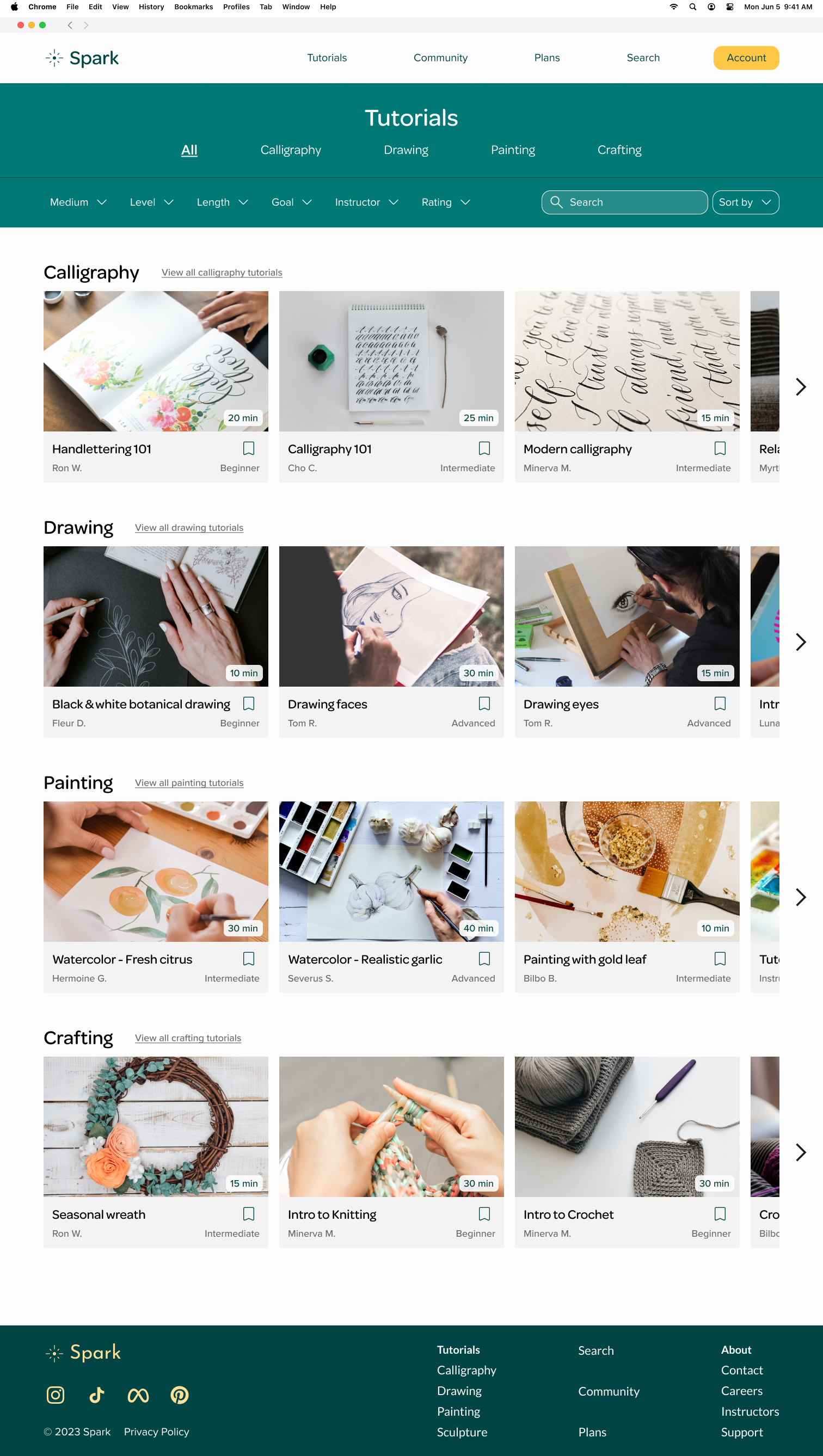
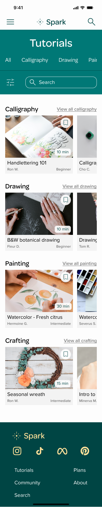
high-fidelity prototypes
The user flows for logging in, creating an account, and watching a tutorial were included in the high-fidelity prototypes.

takeaways
general
This project was my first foray into responsive web design. I learned many important lessons, both from the course and by trial and error in Figma. Important lessons from the course included common website structures and layouts. My own learning included how to set files up more efficiently for size variations - from component variations to establishing typography guidelines for multiple screen sizes.
documenting design stages
As I moved from wireframes to mockups, I made a mistake by changing my original wireframe components as I moved into mockups instead of creating new, separate components. During my six years in landscape architecture, I had well-established systems for keeping design stages separate. This was a wake-up call on how to better manage Figma files. The save version history button is my new friend!