silly walks
silly walks aims to improve and maintain users’ mental health by encouraging them to get outside, connect with friends, and build community.
Role
Product Designer (solo project)
Course
Google UX Design Professional Certificate Course
Project Duration
October 2023-January 2024
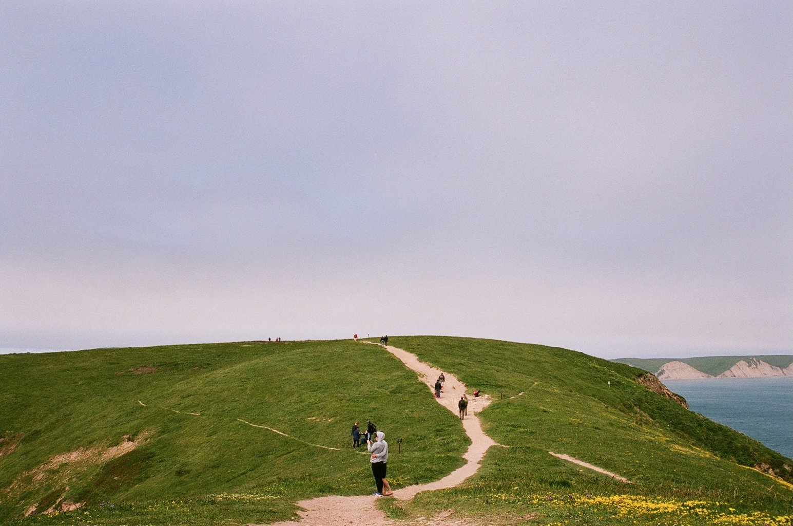
Photo by Shasha Wang
overview
the prompt
Design an app and responsive website for social good.
- Google UX Design Professional Certificate Course
the problem
Users need to connect with their community and get outside to maintain and/or improve their mental health. It can be difficult to keep in touch with friends and even more difficult to become part of a new community.
the goal
Create a platform that helps users improve and/or maintain their mental health by getting outside and connecting with others.
understanding the user
This project was designed as part of the Google UX Design Professional Certificate Course. Friends and family generously gave their time to act as users for interviews and usability testing - thank you all!
user research
user interviews
User interviews were conducted with the following research goals:
Understand how users take care of their mental health
Understand the impact of exercise and community on users’ mental health
Identify barriers to users maintaining and/or improving their mental health
findings
All participants said that both exercise and community play a large role in their mental health.
Users emphasized the importance of connecting with close friends, but also mentioned the importance of more casual daily interactions.
Users who felt disconnected from friends or community expressed the toll it took on their mental health.
pain points
isolation + loneliness
1
Users have a hard time finding new friends and community as an adult. Feeling isolated negatively impacts their mental health.
coordination
2
It can take too much effort for users to coordinate friend’s schedules to get together. Their group chats are out of control!
excessive screen time
3
Users want to stay connected with long-distance friends, but are trying to spend less time on social media and limit screen time in general.
user personas
problem statement 1:
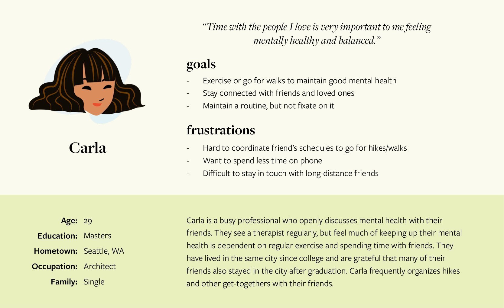
Carla is a busy architect who needs a way to easily organize walks with friends because exercise and being connected with their community are important for their mental health.
problem statement 2:
Frank is a non-profit fundraiser who needs a way to connect with old friends and make new friends because community is important for their mental health and they have been feeling isolated.
starting the design
wireframes
I began by sketching the mobile app as I assumed most users would want to use the tracking capabilities of an app during their walks. I drew multiple versions of each screen, then compiled the strongest elements.
As I transitioned from paper to digital wireframes, I focused on making sure users could:
Easily find and join groups and group walks.
Quickly record walks and plan future walks.
low-fidelity prototypes
As I designed the low-fidelity prototypes I iterated upon and added screens to make the user flows as intuitive as possible. I strove for continuity between the app and website to create a seamless user experience across platforms.
testing
usability study
A moderated usability study was conducted remotely to understand if the app was easy to navigate and if users could complete the core tasks of recording and sharing a walk, scheduling a walk, and finding and joining a new group. Friends and family were the participants for this testing.
Participants completed an SUS questionnaire at the end of their session, which revealed that all users strongly agreed that the app was easy to use and were confident using the app.
insights
All users easily completed the core tasks during testing. Two main insights emerged:
Users wanted to see more information up front.
Users needed easier access to controls on group page.
Below are examples of changes made in response to the first insight.
refining the design
style guide
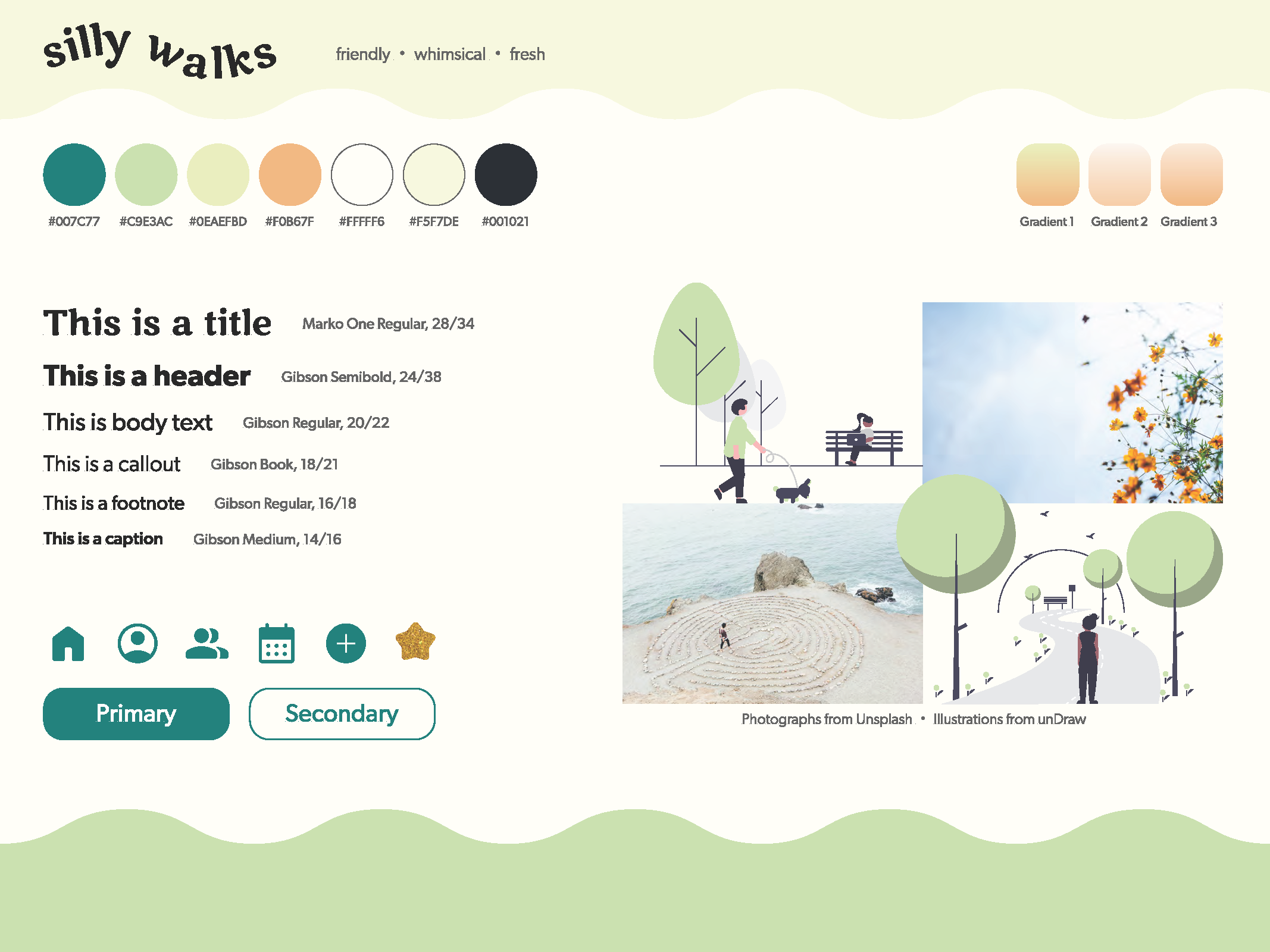
With insights from the usability study in mind, I started refining the design by creating a style guide to establish design intent and establish consistency.
-
Deep teal was chosen for feelings of calm, green for nature and growth, and orange for pops of energy and happiness.
-
Marko One was selected for large titles and headers - the typeface felt playful without sacrificing readability. Gibson complemented Marko One and was used for all other text. (Sizes shown in image are for desktop)
-
Icons were sourced from the Google Materials Symbols. I modified the star icon to be glittery gold so that users could give posts gold stars instead of likes.
-
Illustrations from unDraw were used for the website, and photographs are either from Unsplash or my own.
design system
As I developed the app and responsive website mockups, I built a design system for silly walks. I studied trusted design systems to learn more about setting up component variants efficiently and effectively.
the final product
silly walks app
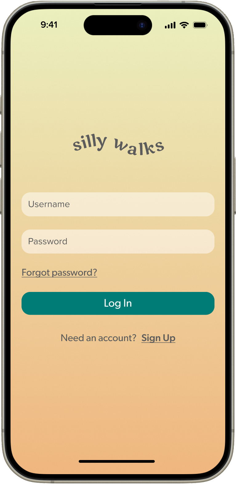
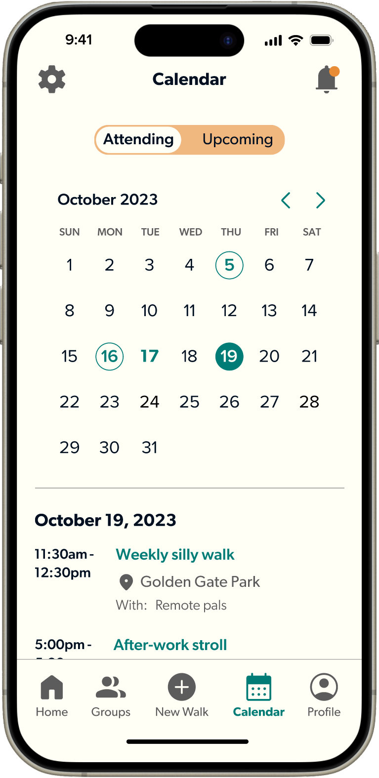
The main screens of the app provide multiple ways to easily view scheduled walks and join walks others have organized. Users can view groups they follow or discover new groups to join, and quickly start a new walk or schedule one for later. The app’s focus is helping people connect with and build community, and get outside.
silly walks website
The website serves users who aren’t inclined to or are unable to download the app, but still want to engage with the silly walks community. While users can’t automatically track their walks on the website, the site offers an easy way to enter and post a walk’s details. The website also features a mental-health focused resource section with articles on topics including mediation and therapy.
takeaways
lessons learned
stay focused on the problem
1
Check in frequently to assess if your design is actually addressing the problem you’re trying to solve.
think about the hand-off
2
Though this was a solo project, I tried to think about how to best set up the project to make a hypothetical hand-off as efficient as possible.
when in doubt, sketch it out
3
When I ran into challenges and needed to iterate upon my designs, I reminded myself that sketching out options was often faster and more fruitful than digital versions.
impact
The friends and family who generously gave their time as interviewees and study participants said they wished this was a real platform. It was an unexpected gift to learn more about how these wonderful people approach mental health. This project has also encouraged me to go on my own silly walks more frequently.
Photo by Shasha Wang

